Getting myself a logo - iameven.com
Is a 5$ logo worth it? Not really, but also too cheap to complain much about, so I made one myself.
Aleksander recently started work on his new website. He's made some changes to his logo, a logo he bought from fiverr, a website for 5$ jobs. He told me about this when he bought it a couple of years ago, but now I was intrigued.
Testing Fiverr
5$ is not much of a sacrifice so I wanted to try it myself. Alas, I was not as lucky with my choice of designer:
![]()
![]()
While I could use either of these (I like the blue one best), they weren't that personal. Nor creative, but I guess they almost met my fairly low expectations. So I went to graphic river and looked at logo templates. The quality is higher, but finding something that works is hard. I found some inspiration in infinity symbols and especially one with two interlocking hexagons. This looked like an E and an A (my initials), in an abstract way.
If you want something done right...
Proper logos are vector files, making them infinitely scalable without loss of quality. I have limited experience working with vector files, at least recently. Even when I played around with flash I didn't use the drawing tools much.
Flash isn't that significant any more, but they still charge for the software. A serious contender is Adobe Illustrator, but I don't really like it. It's also pay software, and I'm not sure their SVG saves are as clean as they could be. So...
Inkscape
It turns out I don't like Inkscape either. I had to double click the tools bar and close an options window to select a tool, every time. Also when I wanted to change colors, line size and fill. Clicking on a shape doesn't select it so I had to draw a bounding box around all my shapes and deselect the ones I didn't want to work with. For some reason clicking works for deselecting. I have not figured out how layers work either.
Despite these challenges...
Ta-da!
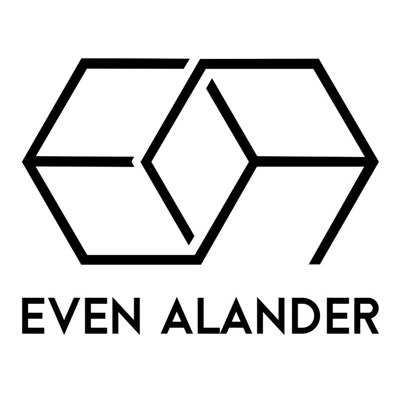
As I played around with the hexagon shapes I noticed they looked like two boxes. Not exactly at the same time, making it sort of an impossible geometric figure. I tried to make the E and A as clear as possible without breaking the illusion. What I don't like is how thin it is at small sizes, so I might have to remake it with heavier lines. At least for smaller sizes. The 3D effect also disappears.
I'm just not to excited to reopen Inkscape. For that reason alone, it's good enough for now.